
Worksheets (WIP)
Simple, Calm, Unobtrusive, Zen

Responsibilities
Determined the priorities and characteristics of worksheets. Arrived upon the zen approach to worksheets.
Created the UX and the UI of the worksheets on figma. Created the first version of the design system to be used for the worksheets.
Worked closely with the visual artist to determine the visual style of zen worksheets
Requirements
-
students grades 6 and above
Target audience
-
Modular and Scalable
Components should be reusable across a wide variety of templates
-
Simple and Gratifying
Experience should be stressfree, yet gratifying
Design Process

We wanted to reimagine the worksheets that were currently being used on our product. The worksheets were fairly straight forwards, although there were a few snags in terms of UX, and the visual design wasn’t appropriate for older kids.
When designing the new worksheets, we initially thought of making mini-games, but decided to go an ultra-simplistic route of design.
We determined that the worksheet should have the following characteristics in order of priority :
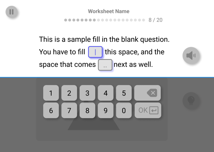
Usable : The worksheets should be very simple to use, and should present the user with no frustrations in terms of interactions and user flows
Scaffolded : The worksheet should provide appropriate help to a learner when they are having trouble, while still being unobtrusive.
Gratifying : The worksheet should feel gratifying to play with, with no dependencies on external gamification systems like points and badges. The visual design, the sound, and the animations should be pleasing enough that nothing else is needed.
Wireframing
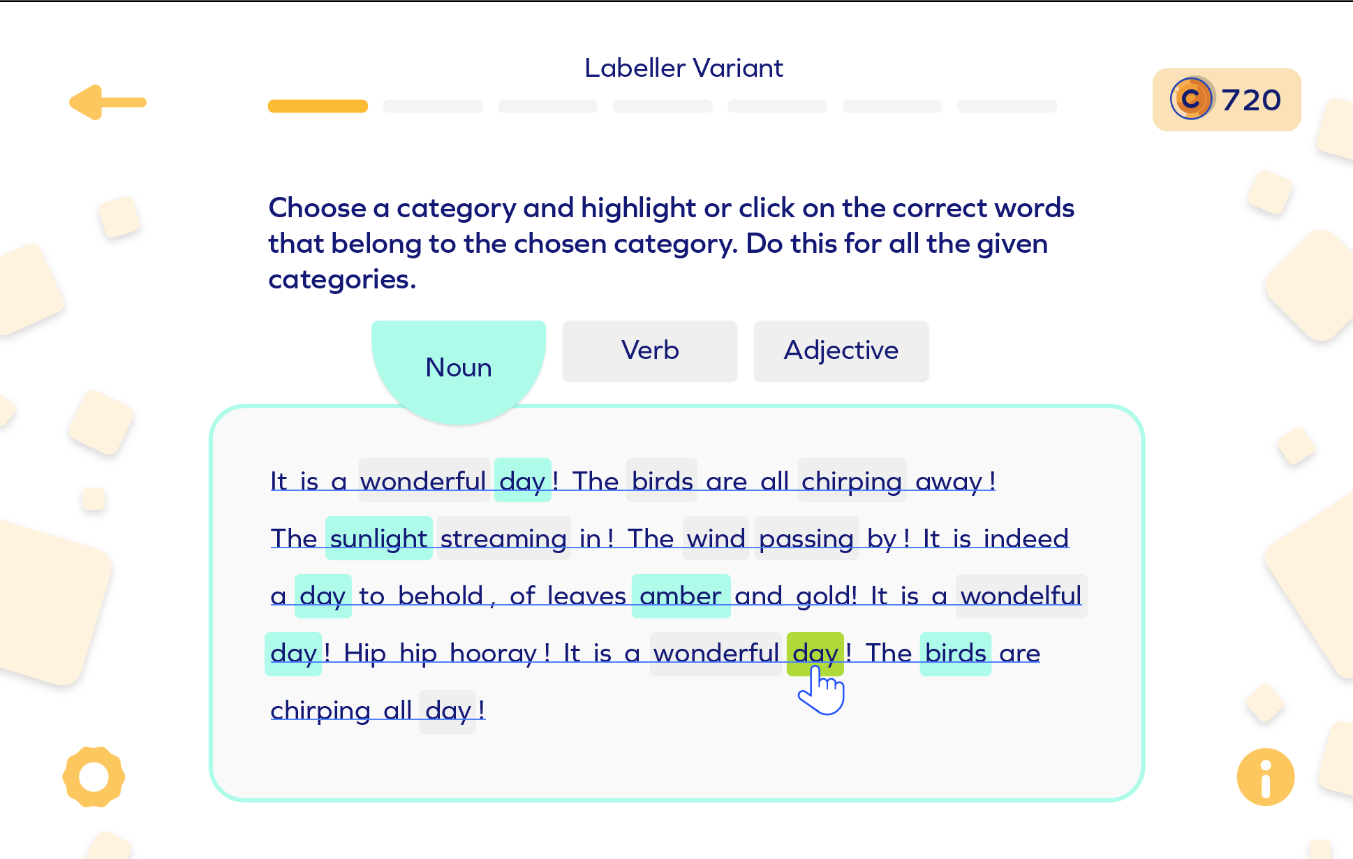
Worksheet templates like MCQs, Match the Following, Sorting were received from the Subject Matter Experts, and wire-framing began. This included the placement and interactions of different elements, and the flow of the worksheet as a whole.


Visual Design
After determining that the general flow of the worksheet works, we moved onto creating variations of the visual design. Surveys were sent out to determine which variants resonated most with the target audience, and that approach was then applied to all worksheets.


Hint System
Another area of interest of was designing an unobtrusive hint design. Research shows that traditional hint systems have 2 flaws : either users will ignore help even if they know they need it (help avoidance) , or over-use, even in instances where could have worked independently (help abuse). Moreover, adults prefer to proactively ask for hints rather than have it be forced upon them.

To combat this, we went to the approach of nudge, don’t force. Whenever the user commits a mistake, we show a response-specific message that provides an explanation of why they were wrong. It can also provide a hint about how to arrive upon the answer.

Moreover, the user can access more help anytime they want by tapping the hint bulb. This will present them with a cheatsheet of sorts that helps the user answer the question correctly.
This project is still a work in progress…